In combination with the hundreds of other layers provided by other departments - layers for roads, trains, lots, water courses, and buildings - maps that highlight the infrastructure by material, capacity, age, and condition can be displayed at will. The database was integrated with all the inspection and work-order records kept in the Oracle WAM work-order systems and could show where all work for the last decade had been done.
 Calgary had the best database of main breaks almost anywhere: some date to 1956.
I finally was able to prove, statistically, that in Calgary, where all main breaks have been treated with a magnesium anode during their repair, that main breaks more than five years old are not well-associated with future breaks.
Also note in this snap, my symbology for showing that an anode retrofit job had been done on a main, after we started pro-actively putting anodes every 10 metres down DI mains from 1999 onward. The protected mains show up with a pink-coloured "shielding" on either stide of the pipe.
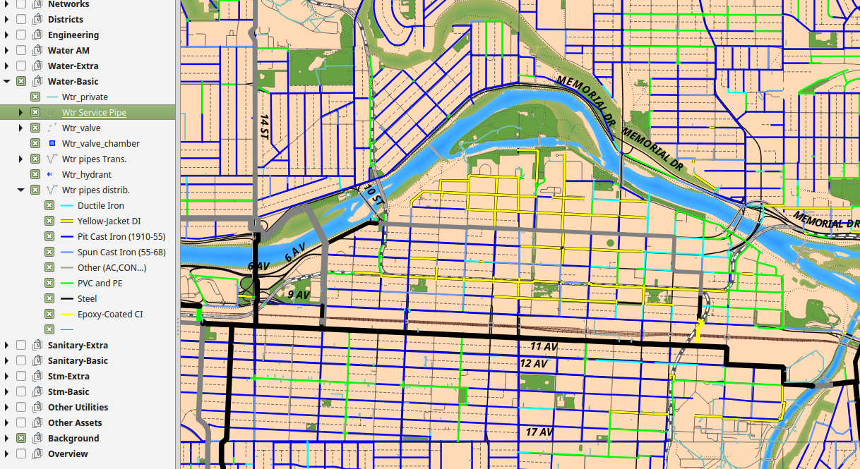
 This image shows the data from the two programs that I was proudest of. The coloured dots going along all the streets with blue (metallic) pipes on them are soil resistivity values, which can be collected for a few dollars each using a Geonics Resistivity Meter. They are colour-coded from blue (cold soil) to red (hot soil) for how corrosive the soil is likely to be. Soils with less resistance to electricity flow have more ions in them, like sulphates and chlorides; the rust reaction moves faster and more iron is lost per year. Knowing where all of Calgary's "hot" soils were was instrumental in replacement and anode retrofit planning in the late 1990s and early 2000s.
The yellow stripes with black lines and more coloured dots in them are all the data from PICA "SeeSnake" runs - a "smart pig" tool that PICA is able to run through a water main with no excavation, because it is able to get into the system through water hydrants.
It comes back with the wall thickness of the pipe for every 6m pipe-length, which is denoted by the closeness of the two black lines - narrower means less wall left. It also comes back with the three deepest pits in each pipe-length, by % of wall remaining. Again, I went with a cold-to-hot symbology where the orange and red pits are the deepest. About one red pit in ten (in loose soils, one in four) will turn into a main break every ten years.
This data made replacement decisions easy and certain; but we still had the soil resistivities and exact break counts and descriptions where we couldn't prioritize an inspection.


